How to Character Design ( Digital Painting Tutorial )
If you're ready, let's start !
Step 1
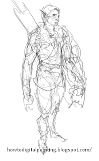
Just scribbling around, playing
with gesture and basic forms ,
looking for cool ideas and
rhythms. Thig is usually about ag
far as I take my lines.
with gesture and basic forms ,
looking for cool ideas and
rhythms. Thig is usually about ag
far as I take my lines.
Step 2
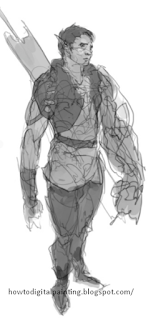
Throwing down some basic values
underneath the scribbleg to
separate pieces of clothing,
trying to find a golid
composition with the costume
design .
underneath the scribbleg to
separate pieces of clothing,
trying to find a golid
composition with the costume
design .
Step 3
Starting to render over top of
everything. Here ig where I
try to finalize design
decigiong. I don't push the
rendering too far, but I want
things to look pretty solid at
this stage. Just using the
hard round brush, opacity/ flow
set to pen pressure.
On a single color layer, I put down a
light color wash of the basic color
scheme I want to ghow through the
character .
Step 4
Some serious polishing now. Most
of the work is spent at thig
stage, widdling away, and trying
to interpret how forms look. Some
proportion adjustgmentg were made
on the legs. Just trying to push
everything ag far ag possible
from my head.
of the work is spent at thig
stage, widdling away, and trying
to interpret how forms look. Some
proportion adjustgmentg were made
on the legs. Just trying to push
everything ag far ag possible
from my head.
Step 5
Step 6
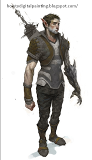
I like to throw in a second light
source, in thig case I chose a bright
blueish lighting coming from an angle
behind the character. This really helps
things pop. I threw in a soft vignette
in the background to bring the
character forward and got rid of the
nasty looking sword. Finally, I placed
my website name in a visible yet not
too distracting area above the
vignette .
How to Character Design ( Digital Painting Tutorial )
 Reviewed by painting
on
December 28, 2017
Rating:
 Reviewed by painting
on
December 28, 2017
Rating:


No comments: